Kelowna City Concert Band
Challenge
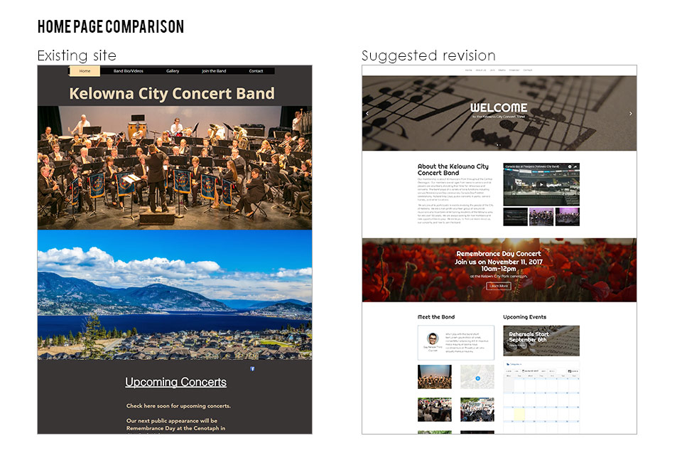
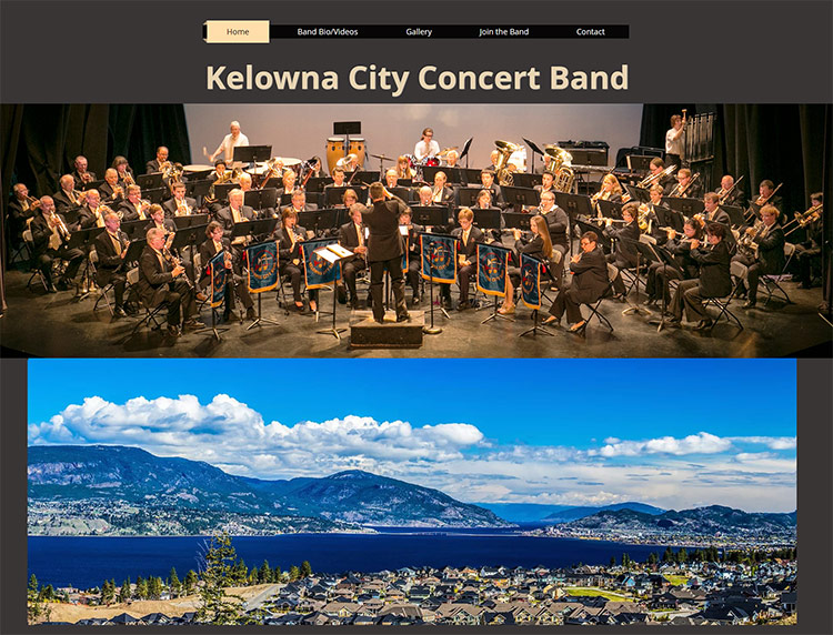
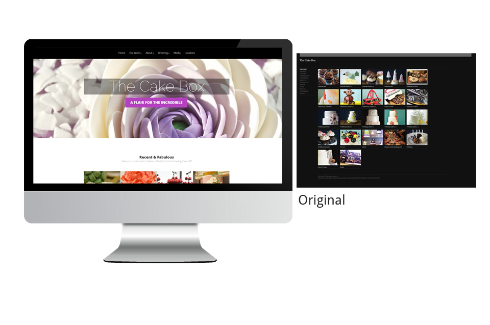
Home page Slider
The home page images introduced both the band and Kelowna, but the band image was several years old. While we could take a new one, the chances of having that updated regularly are fairly slim. I found the images offered very little else in the way of information and weren’t really working for the overall visual aesthetic either.
Solution
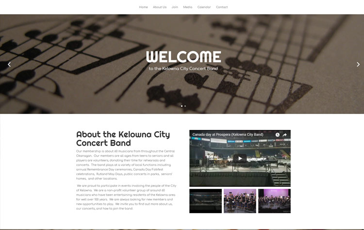
Home Page Slider
I changed the static image to a more generic music slider image so that it could be used for a friendly welcome message to help set the tone and voice for the site while having a consistent image that wouldn’t need to be updated. Also by adding a slider, images of the band could also be used and important dates (like concerts, rehearsals or other promotions) could be featured.
Challenge:
The home page lacked content beyond the upcoming events. The font size and style didn’t make the information easy to read or absorb and I felt it wasn’t speaking to the purpose of the website.
Solution:
I felt that the home page needed to tell users more about the band right from the start – who we are, why we exist and what we are all about. The website audience falls into three main categories from what I see:
- people looking to join the band and want to know more about it.
- people looking for when the concerts are.
- band members looking for updates on where to be and when for concerts and rehearsals.
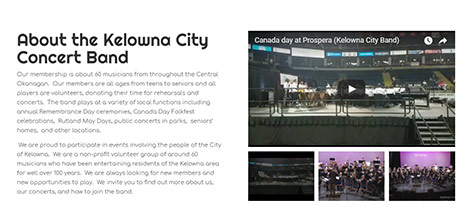
I decided to start of the site with some introduction text along with some videos of the performances so both people who are interested in joining and people just curious as to who we are and what we do can get a sense of that quickly.
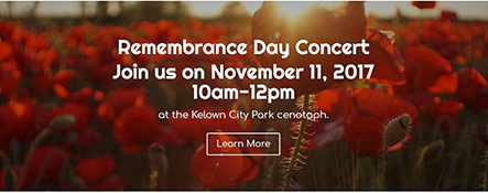
Following that, I decided to put in a full width call-to-action with information on our next concert date. It has more visual impact with clear dates and times for the concert.
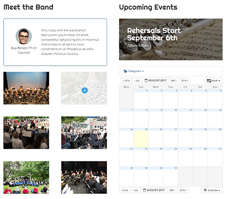
To connect more to people who would be interested in joining the band, I decided to add a slider with short bios of band members. I felt this would give the site more personality. People who are interested in joining the band can see who some of the members are and why they play with the band.
Another call to action could be placed for upcoming rehearsal dates or anything else important, like reminding band members to RSVP for their participation in the next concert.
I followed this section with an image gallery of the band beside an events calendar. This would satisfy people wanting to know more about the band and those who just want to know when the next concert or rehearsal is. I think the format is quicker and easier to understand for those who are looking for concert dates. I also categorized the events for concerts, rehearsals and other special events so the events can be easily filtered.
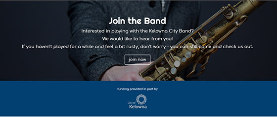
Next, I added a large call to action for people who want to join the band. An invitation to join I feel is more likely to get a response by prompting them to make that first step.
I added a place for funders and sponsors. This section could also be used to assist in fundraising by providing companies a spot for their logo and link.
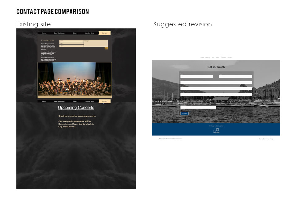
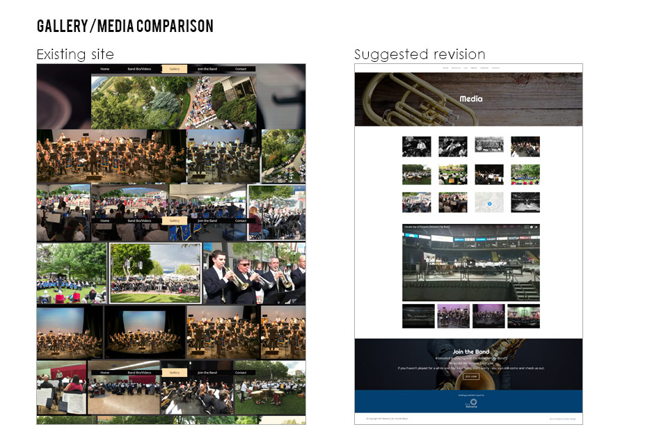
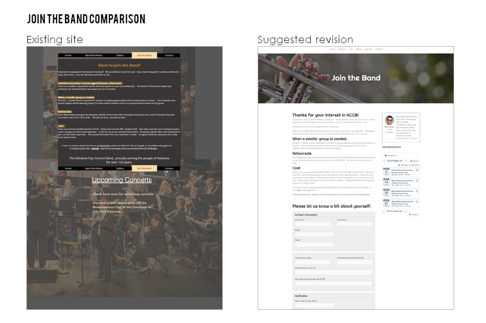
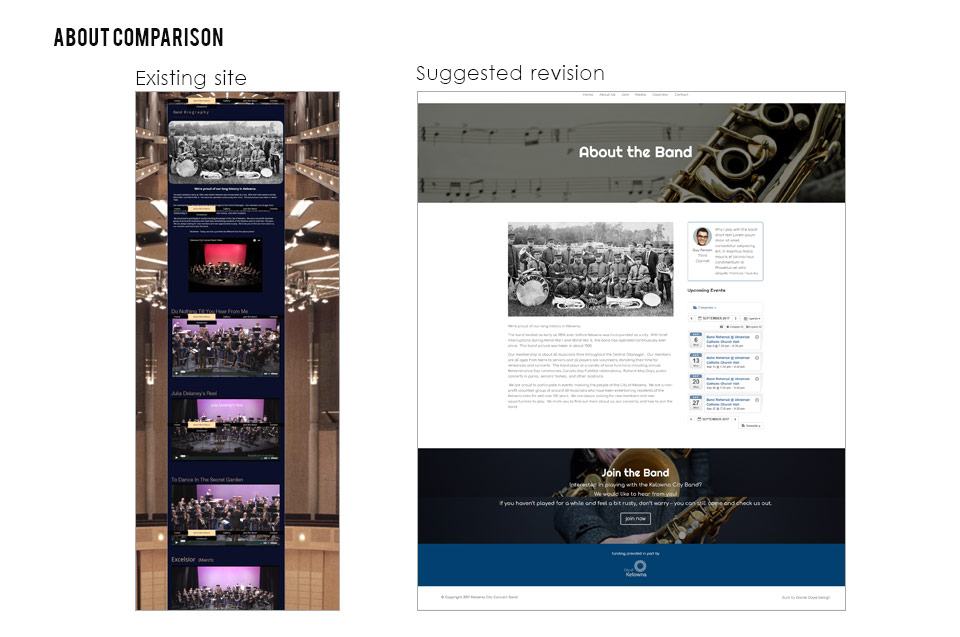
Challenge:
The inner pages presented similar challenges to the home page. The information was all there, but wasn’t presented in a consistent format that added to a cohesive visual style.
Solution:
- I made the inner pages with the same style template with a large, bold musical image.
- Larger header fonts are used to make the content more scannable and easier to see the breakdown of information and hierarchy.
- Sidebars are used for displaying upcoming events.
- A form is added to the join page for a clearer call to action besides just emailing a contact, which will also give website administrators replying more information about the person and their interests before reaching out.
- The image gallery is more contained and easier to view.
- The videos have been added to the same page so all media can be in the same place.
- I added a subscription section for users to sign up for concert notifications so we can start collecting metrics on our audience and start some e-marketing.
Future suggested enhancements
- Add a news section for any media coverage in newspapers or radio.
- Integration with the program used for band members to RSVP to concerts.
- Social sharing of events and news
- Separate login section for members to view and download board agenda meetings and any other organization documents.
- Possible event ticket purchases.
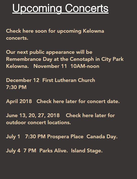
Existing website page